Unless you’re a professional or a seriously dedicated home chef, your first thoughts about kitchen design might skew more aesthetic than functional. So while some experts claim the only way to design a kitchen is using the triangle rule, other interior designers have assured us: You can love the triangle rule or leave it.
First: What Is the Kitchen Triangle?
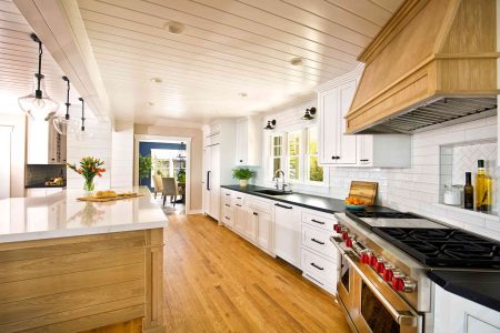
As Keith Myers, Design Director from The Myers Touch, tells us, “The kitchen triangle is based on the three main work areas within the kitchen: the sink, the fridge, and the hob [or stove/oven]. According to the rule, these should be laid out to loosely form a triangle, enabling you to perform day-to-day tasks with ease and without any obstruction.”
But is the kitchen triangle rule truly essential? These designers say not always—here are four reasons you may want to skip it in your space.
-
01
of 04More Space Means More Freedom
While Lizzy Laing of @renovationHQ says that she loves the triangle rule for small spaces, larger spaces might allow for more creative liberties: “In that instance, the opportunity to be more creative in the space is much wider. Perhaps you feel that you need to zone your space based on how your family uses the kitchen, or maybe you have a larger-than-average family. This [might mean] you need way space for people traffic.”
Plus, the luxury of space allows you to adapt your kitchen to suit how you use it most often. Sure, for some people, a highly functional home kitchen is a must. But these days, “the way people use their kitchens in this modern world is so diverse,” Laing says. “The kitchen is a space to entertain friends as well as for the kids to do their homework. In a world where convenience is king, some families don’t cook in their kitchen anymore because their lifestyle demands more of an eating out culture, or family meals happen elsewhere.”
“Before embarking on a kitchen design,” Laing says, “really think about what your space will be used for. [That] will enable you to plan or zone your space in the best way possible.”
-
02
of 04Knowing Your Kitchen’s Activity Center Is More Important
Bob Bakes, Co-Founder and Head of Design at Bakes & Kropp, says it’s less about the perfect triangle shape, and more about finding your kitchen’s true heart.
“Kitchen layout should be determined fundamentally by the activity centers,” he says. “We still like to use some of the framework of the original ‘working triangle’ concept created years ago. This consists primarily of areas for preparation, storage, and cooking. [But] in recent years, the activity scope has significantly increased and every kitchen layout will be different depending on the space.”
-
03
of 04You Might Need Multiple Workspaces
While some might feel their home kitchens don’t need a triangular workspace, others might feel they have too many prep spots to fit into just one triangle. When determining a kitchen’s layout, Bakes and his team consider both primary and secondary spaces.
“We take into account that the modern kitchen layout has expanded in ways,” Bakes says. “Now there are secondary dishwashers and secondary sinks, coffee makers, and secondary cooking positions. Most kitchens have some kind of significant seating area or congregation area as well. There’s a lot more that goes into a kitchen than there used to be.”
-
04
of 04Rules Were Made to Be Broken
Stephanie Summers-Mayer, Home Improvement Expert andBrand Host at HSN, feels it’s time to break free from the confines of this old design rule: “Rules were meant to be broken, and when it comes to the golden triangle rule, I say fear not when you want to break away from this traditional way of design.”
“The triangle concept has been used for more than a hundred years,” she says. “That said, today’s kitchens are very different. Consider the pros and cons of the old logic, but don’t let it box you in. Examine the space you’re working with, evaluate traffic flow between each zone, and go with what makes sense with your needs.”
As the heart of our homes, a great kitchen is going to come down to how much your family uses and loves the space. Like Summers-Mayer tells us, “You overlook a lot of interesting design opportunities if you focus more on the rules than the people.”
Read the full article here


